Monday, 16 January 2017
Don't Dream It's Over: Second Minute
As you can see some changes to the first minute of my music video have been made. For example, I have filled the gap in my original video with clips and also shortened some of the clips in the process of making sure that the lip-syncing was in time. I attempted to slow down the second bath clip but after decided that this made the atmosphere of the introduction less snappy and impactful so changed the length of the clip back. I dislike the section that occurs before the chorus and will hopefully make changes to it within my next draft.

Monday, 9 January 2017
Don't Dream It's Over: First Minute
This is the draft for the first minute of my music video. This will be subject to change, once I gain feedback from my target audience and the current blank spaces will later be filled with clips when I decide what I think will fit best in these areas. I have rematched this video multiple time and have already decided that there are some things that I would like too change to improve this sequence. For example, I feel as though some clips are too short and other too long and also think that I could be more adventurous in my use of transitions. I may also possibly use a warmer filter on some of the clips in future. I will re-upload a final version of the first minute after change have been made.
Sunday, 8 January 2017
Target Audience Feedback: Logo
I selected three possible font choices for the lettering of my record company name to a group of my target audience to gain feedback on what they preferred.
FONT ONE:


FONT ONE:

FONT TWO:

FONT THREE:

I asked them:

The response was:


Most of my target audience preferred the third font for my logo.
I then asked them which sketch design they preferred and why out of these three choices:


These are the responses I received:


My target audience leaned more toward the design of the last sketch so I have decided that my logo will be based on this idea.
Wednesday, 4 January 2017
Record Company Name Ideas
I have come up with a variety of Record company name ideas but I am unsure of which name suits the indie genre more so I have asked my target audience for their input. Here is what they said in response to my question:


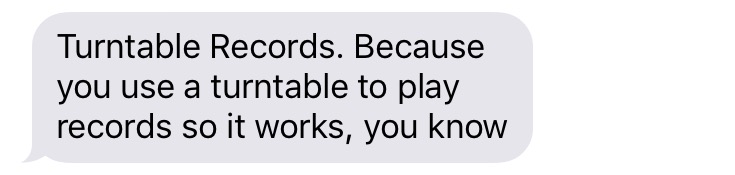


The general consensus of answers for this question was that the names 'Static Records' and 'Scratched Records' were the most popular among my target audience.
Though this may be the case I have decided, as the creator, to go with name 'Turntable Records' as I think this name is more preferable and I have more ideas about how I would create an eye-catching logo for this brand name.
Record Label Logo Construction

First I opened the scanned in image of the drawing that I wanted to use for the logo.

I then used opened the JPEGs of the font I had downloaded from http://www.dafont.com and then used the free transform tool to resize the image and position them where I wanted.

Next I used the transform skew tool to skew/slant the text to fit the aesthetic of the image.

Finally I used the rotate tool to position the text vertically in a similar way to how the image is which created continuity of design.
Tuesday, 3 January 2017
UNUSABLE FOOTAGE
Though I did get some footage during my filming process I also recorded a lot of footage that later turned out to be unusable. By going over this footage each day I was able to review how the filming process was going as I was doing it which has taught me about what works and watch does and allowed me to rectify any mistakes I have made through re-filming so that I have all the footage I need to create my music video.
Here are some examples of unusable footage and why I decided that these clips wouldn't make it into the video:
Here are some examples of unusable footage and why I decided that these clips wouldn't make it into the video:
CLIP ONE:
In this shot I was experimenting with changing the exposure on my camera as the shot was initially too dark but found that this overexposed my actress to the point where her facial expression and lip-syncing was barely visible. This therefore made for an unsuccessful shot as the audience would be unable to see that she was lip-syncing and my actress' skin tone would be inconsistent.
CLIP TWO:
I found that the composition of this shot seemed too cluttered and that the footage was not aesthetically pleasing. I'm glad that experimented and reviewed this shot whilst on location as this realisation allowed me to make changes while filming and move the ballet shoes to a more minimalistic setting, allowing the prop to act as a more focal point in the footage.
CLIP THREE:
This shot was disrupted by the glare on my camera (the green dot) which ruined the earthy and natural atmosphere my actress' surroundings. Though I salvaged some of the footage at this location, by cropping the frame, I found that the glare in this shot could not be cropped out without spoiling the composition of this long shot.
CLIP FOUR:
Though there was nothing technically wrong with this footage, I thought that it looked altogether quite strange and that the bright red background of the shot did not fit in very well with the natural colour scheme and atmosphere I was trying to maintain.
CLIP FIVE:
The issue with the final bit of footage was how shaky my camera work was; even after I stabilised this clip during editing I found that it was still unusable. Through reviewing this footage on location i was bale to correct the way I was holding the camera to create more stable and usable footage.
DAY TWO, THREE AND FOUR OF USABLE FOOTAGE
This is a compilation of the usable footage I collected during my filming of days one and two. Though there is a strange glare on some of the footage from the sunlight, I have decided that by cropping the frame of the footage slightly that this will still be usable footage.
Subscribe to:
Posts (Atom)