Friday, 31 March 2017

Evaluation: Question One


Part One:


Part Two:

This text is to be read in conjunction with the viewing of my music video.

The video opens with a title slide of the artist’s name and the name of the single alongside it. This title has a headline-like feel to it which links well to the sequence of clips that follows on from this. I have included a news clip audio as an opening to my music video before the music starts, this subverts the conventions of a music video as the music tends to start right away in most videos. I decided to include this as it added context to the message that I wanted to send which was the idea that the media has been telling us who to be and how to think for so long that we have become desensitised to the harrowing messages it sends us about the actual goings on in this world (based off the line ‘in the paper today tales of war and of waste but you turn right over to the TV page’).
The beginning sequence of clips is compiled of mainly of close up shots, mid shots and tracking shots, used to establish the scene, follow the action and introduce my actress to the audience.
This is a narrative/performance form of video so I have used continuous shots throughout, as is conventional for the video type, to maintain a fluid sense of story-telling without too many breaks. I do however challenge this convention at the beginning of my video using many short clips and jumpy editing this is because I felt such editing would fit with the high tension of this section of the video.
I have also followed the conventions of lip-syncing that is often used in music videos, and have shown my actress lip-syncing through mid-shots and tracking shots to show that she is the music artist and the main protagonist of the video. My actress uses direct address whenever lip-syncing which allows the audience to feel a personal connection to the character and engages them in the telling of the story.
I have also conformed to the smooth editing techniques of the indie genre of music videos and used fade transitions throughout to allow the clips to blend into one another and I have also layered videos over one another to create a dream-like and dynamic effect.

In terms of lighting I have used only natural light as much of my video was set outside, I feel as though this creates a very natural feel to whole video which is representative of the very raw atmosphere that I wanted to create.

Thursday, 30 March 2017

Digipak Construction

Front Cover Construction:


To begin making my digipak front cover I opened up my parchment image and resized it to fit the background (14 by 14).


I then opened up the main image I wanted to use that I had altered and copied from the creation of my poster. 


To finish I used the free transform tool to resize the image to fit the background.


Inside Cover Construction:

To start the creation of my inside cover I opened up my parchment image and resized it to fit the square I had created (width 14, length 14) using the free transform tool.


I then added my desired quote using the text tool in the font monotype cursive. I then experimented with font sizes until I found one I thought appropriate (24pt) and used the text align tool to position the text centrally in the square.


I then added a mock signature of my artist that I had created on a website called http://www.onlinesignature.in. As these images already come photoshop ready I did not have to use the magic wand tool at all and only had to resize and position it using the free transform tool to the size and location I desired.

CD Tray Construction:


First I opened up the parchment image and resized it to fit the square using the free transform command.


I then opened the scan of my hand drawn image and used the magic wand tool to remove any excess white that I didn't need from the drawing. I used the free transform command here as well to resize the image to fit the square.


This was the outcome for my CD tray, though the image looks rough and parts of the drawing got lost during the use of the magic wand tool I thought that this gave the image more character and worked perfectly for the kind of aesthetic I was trying to create.

Back Cover Construction:


I opened the parchment image I had been using and for the rest of the digipak and used the free transform tool to resize the image.


I then opened up the hand drawn bird image I wanted to use for this part of the digipak and use the free transform tool to resize the image to the size and position I wanted as can be seen down below.


I used the magic wand tool to select the areas of the image I wanted to get rid.


And then deleted these sections so that I was left with just the birds.


Next I used the line drawing tool to draw a line across the shape which acted as the line that the birds appear to be perched upon. During this process I also used the rotation option to tilt the line in that way that I wanted it.


To add the song titles I used the text tool.


I continued to add song titles and positioned them centrally.


I used the text tool in a smaller font to add the copyright information that is typical of a digipak at the centre of the bottom of the cover.


Next I added the barcode to the bottom left hand corner and used the free transform tool to resize and position the image.


I then opened my record label logo, selected the image and pasted it onto my back cover.


From there I resized and moved the logo to the position I wanted it.


I then used the magic wand tool to remove any excess white space that I didn't want. 


As this concluded the construction of my digipak back cover I saved the document as a JPEG and uploaded it to my blog.
Spine Construction:


I first created a document in the shape typical of a digipak spine (width 3, length 14) and added the parchment image to the document and then went on to resize this using the free transform tool.


I took the main image from my poster and digipak front cover and copied it into the document. Using the free transform tool I resized and positioned the image at the top of the spine.


Next I added the same typography from my poster to the spine and used the free transform tool to both resize, position and rotate the image so that if the digipak were to be turned horizontally the artists name could easily be read.


Lastly, using the text tool I added a small catalogue number to the very bottom of the spine under the artist's name.

Poster Construction


First, I opened the parchment image into a new document and used the free transform tool to resize it to the scale that I wanted. After this had been done I opened the main image that I wanted to manipulate and used the magic wand tool to select the white section of the image that I didn't want.


Then I used the free transform tool to resize image to fit the page.


Next, I used the paint bucket tool to fill in the sections of the drawing that I wanted coloured.


I then opened the font I wanted to use for my artist name and copied and pasted it on to my poster as can be seen below.


I used the magic wand tool to select the parts of the image that I didn't want and deleted them. to resize and position the font I used the free transform tool.


Next, I added the iTunes logo to my document and deleted the white sections using the magic wand tool before resizing the image with free transform and moving it to the bottom left hand corner of the page. I repeated the same process for the Spotify and DEEZER logos.


Next I added the text to my poster using the text tool and adjusted the font and size using the text options. Using the curser I repositioned all of the the text to the appropriate areas.


Using the same process I then added the names of the magazines 'GQ' and 'NME' to either side of the main image.


Above this I added a star; an image I had opened into the document and modified using the magic wand and transform tools.


I wanted to duplicate these stars so copied the layer 7 more times and adjusted the position and size using the free transform tool.


Digipak

Front Cover:

Inside Panel:


CD Tray:

Back Cover:


Spine:

Poster


Digipak and Poster Audience Feedback

After finishing the construction of my digipak I decided to seek feedback from my target audience to ascertain whether my product was appealing for the audience or if any changes had to be made.


Tuesday, 28 March 2017

'Don't Dream It's Over' Music Video (FINAL)

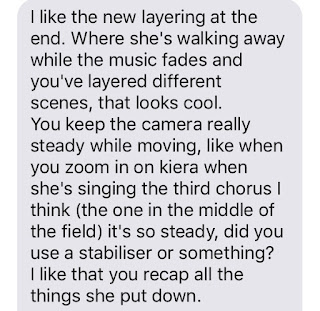
Music Video Audience Feedback (Final Version)

I asked for target audience feedback on the final cut of my music to ensure that there weren't any glaring mistakes I hadn't picked up on and to get a final idea about what my audience really think about my media product.